Resources
Everything you need to know about the data center industry in one place, from podcasts to thought leadership articles.

Podcasts
Watch/listen to Compass’ podcasts: Not Your Father’s Data Center hosted by Compass CRO, Raymond Hawkins, and Extending the Ladder hosted by Compass CIO, Nancy Novak.
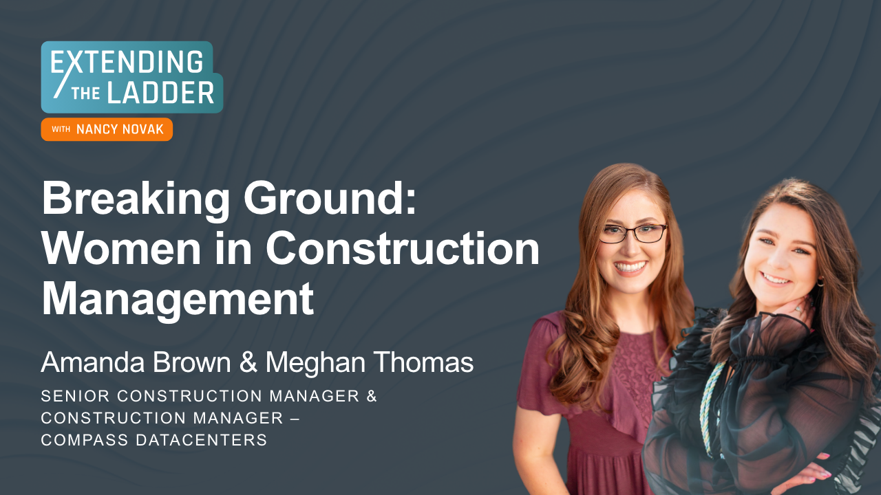
Breaking Ground: Women in Construction Management
Amanda and Meghan share their inspiring journeys into the construction industry, highlighting their background, challenges, and achievements.
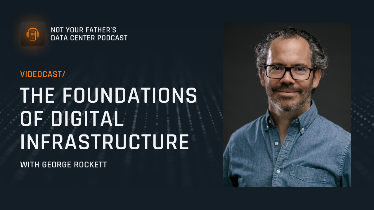
The Foundations of Digital Infrastructure with ...
Step into the world of digital infrastructure with Raymond Hawkins and George Rockett on this episode of Not Your Father's Data Center!
White Space as a Service
Data Centers, Veterans (*Transition Tips)
Compass Quantum: modular data centers delivered as a service. Each module offers the space, power and cooling required to run 100kW of IT equipment in...
Watch
The 90 Day Transition
Compass Quantum GM, Tony Grayson, talks about the stress and loneliness of the transitioning journey and shares some tips for the military in transiti...
Watch
The Value of Networking
In this Transition Tips post, Compass Quantum GM, Tony Grayson, talks about the value of networking.
Watch
Data Center Demand Forecast: We are Going to Need a Bigger Boat
In this post, Jonathan Schildkraut, Compass’ SVP of Capital Markets and Investor Relations, analyses forecasted data center demand growth.
View
Allyship in Tech: How to Support Women in the Workplace with the Power of Curiosity, Vulnerability and Humility
At this year’s Pacific Telecommunications Council (PTC) conference, Compass Director, Cloud Sales, Chelsey Cooper, and Director, Marketing, Fra...
View
Defining Scope 4 Emissions
Understand why Scope 4 emissions are avoided emissions, and learn how they represent a proactive and innovative approach to sustainability!
View
Defining Scope 1, 2 and 3 Emissions
Scope 1, 2 and 3 are categories of greenhouse gas emissions that can help us understand and reduce our carbon footprint. Learn more!
View